Sometimes it’s hard to believe there was a time when the Adobe Creative Suite didn’t exist. Prior to the late 1980s, if you were creating an advertisement or illustration for a magazine, cover art for a video game cartridge, a movie poster or a book cover, you did it the way it’s been done since the dawn of the retail age: ink, paint, X-Acto knives and airbrushing. This article deals with the airbrush, in particular, airbrushed video game art.
The early 1980s were the glory days of the airbrush in commercial video game art. This is partly because many of the games were so simplistic that just showing a screenshot of the game wasn’t going to turn many heads. Marketers needed a piece of art that would tell a story. A detailed piece of fantasy artwork could convince digital adventure seekers to shell out their hard earned cash or allowance. Using an airbrush enabled the artist to create art that was cutting edge, sharp, crisp and dare I say, like it came from a computer. Or whatever people imagined a art from a computer would look like. No other tool gave you the ability to quickly create sci-fi and fantasy settings with all the dimensionality, shadow, shine and glow that made it pop off the page.
Of course the airbrush wasn’t limited to paper media. The movie “Tron” took place almost entirely inside a computer video game and was limited by the same constraints as print media. Only a few seconds of actual computer animation made it into the film. The rest relied on analog technology and heavy use of airbrushed matte paintings. The airbrush made it seem otherworldly. Like it hadn’t been created by hand but had been imagined into existence by some artificial intelligence.
I may be overstating it. What you will see below is a mixed bag. There’s some excellent airbrushed art here, but some is downright amateurish. Given the limited budget some of these independent game publishers were dealing with, I imaging there were a lot of brother-in-laws, cousins and interns creating ad art when they weren’t quite up to the task.
By the way, click the images below to see the full pages they were taken from.
Posts
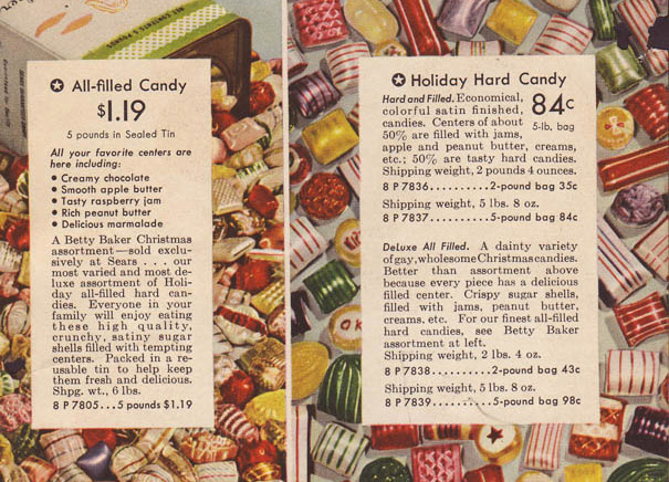
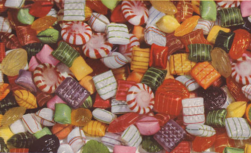
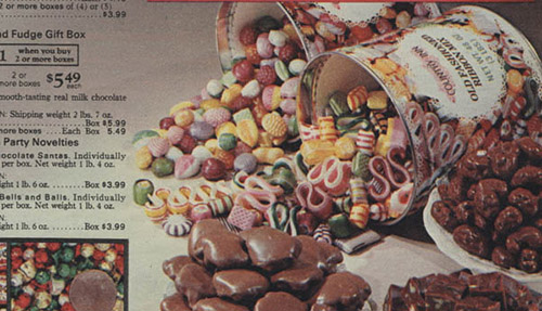
Hard candy. Boiled sweets. Teeth Crackers. Call them whatever you like, these colorful, iron hard confections remind us of Christmas at Granny’s house. Whether they be fruit or mint flavored, drops or ribbons, tinned or jarred, we kept going back for more! And if mom or dad told us we’d had enough, granddad had a private stash by his recliner that he’d share on the sly.
This is a tribute to that time honored holiday goodie. Taken from the pages of vintage Sears catalogs from 1937 through 1979, these colorful pages are almost good enough to lick. I again extend my apprciation to the folks at Wishbookweb.com for making these scans available. If you’re into 20th century advertising design, department store history or just enjoy looking at the Christmas catalogs from your childhood, this is an amazing website! Go there!
As always, click any image for the full page scan.
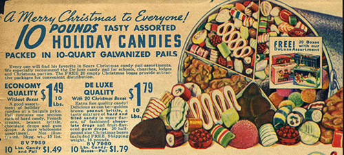
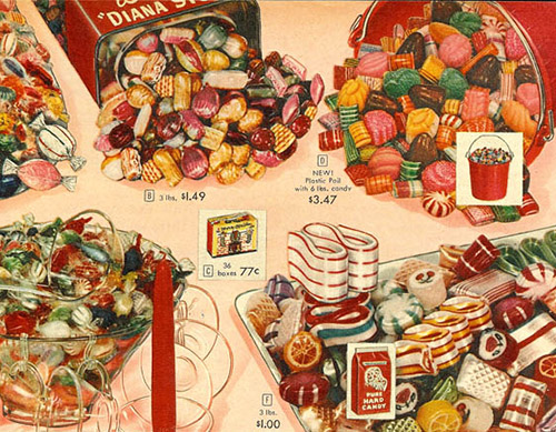
Ten pounds of candy for a buck and change. I feel like that was a bargain, even for 1940. I could be wrong though. It’s possible you could have bought a car for a dollar fifty in 1940. I don’t really understand inflation.
I like that the pail depicted above is divided into multiple sections. This is the precursor to the modern flavored popcorn cans that are so popular around this time of year.
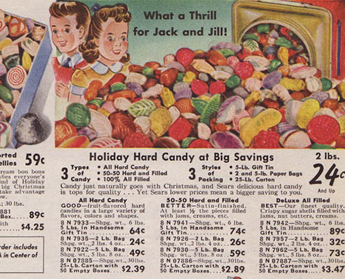
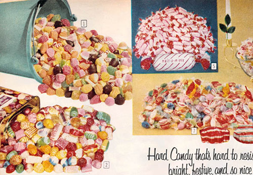
Jack and Jill went up the hill to fetch a tub of candy. Jack munched down and broke a crown and Jill just swilled some brandy.
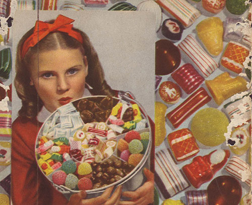
Okay, let us be clear. This little girl is greedy. The photographer didn’t need to say, “Okay Clarissa, we need you to hold the candy bucket like it’s your prize dolly.” She was way ahead of Fred the Photographer on that one.
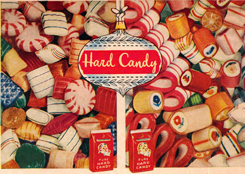
I like the chopped stick candy with pictures running through the center. Reminds me of British ‘Rock’ stick candy that they sell by the seashore. I assume it’s made exactly the same way. Take that Brits! Sears stole your rock candy! Or did you give it to us during Lend-Lease?
Also, regarding the stick candy chunks in the image above, does that one near the middle just say, “OK”? That’s a bit of a bore, isn’t it?
Starlight mints? Get those out of there! We have candy canes on the tree! Who, in their right mind, would reach for a starlight/pinwheel when there’s a lovely curved stick that you can suck to a point? They taste exactly the same, and the candy cane has the added benefit of being able to torture little brothers and sisters. The candy cane is a multitasker!
More broken sticks of rock, these with flower images inside. And an overabundance of starlights! Space fillers, all of them!
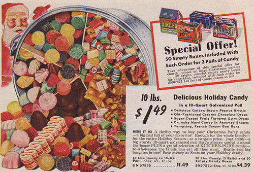
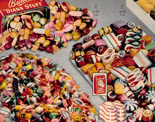
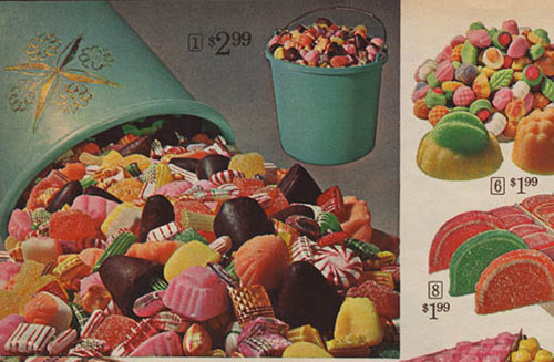
You know, for as much holiday candy as I’ve eaten, I don’t think I’ve ever been presented with a piece of ribbon candy. They’re all the rage in these ads. Also, the above ad may be my favorite from all of these. I love the high contrast. It’s like they painted black into all the nooks and crannies between the candy. I just love it.
Candy that comes in a collared tin, like the ‘Diana Stuft’ tin above, seems slightly impractical. I’m from Florida, and the humidity here makes just about any sugary substance extra sticky, extra quick. I imagine that any confection left in there by January 1st is going to have to be chiseled out with an ice pick.
Woof, this is a motley combination of hards and softs. There are hard candies mixed in there, but they’re being overtaken by jellies and, ick, french creams. What’s wrong with you, 1964? French Creams just look like the 1960s, folded into a confection. French Cream: The mod dress of the candy world. Except I actually like mod dresses.
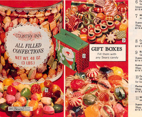
Color! May your eyes be be ever seared by Christmas red! Also, Country Inn makes a big bold appearance! See my Christmas fruitcake article for lots of Country Inn. I still don’t know if it was a Sears and Roebuck brand, but I’m hoping one of you will fill me in! Comments below!
And as we depart the 1970s, the blandness of 1980s catalog coloration and design begins to bleed backwards. Still, those Country Inn tins remind me of my youth. My family had tins just like this around the holidays and it fills me with warmth.
Also Check Out….
If you enjoyed this post, be sure to check out my other Department Store Christmas catalog tributes. More to come in over the next few weeks.
Those wonderfully tacky Sausage and Cheese gift packs!
The gift that everyone dreads, the Christmas Fruitcake!
And don’t forget to visit Wishbookweb.com! It’s the best place to make the fantasy Christmas list that the 11 year old you would approve!
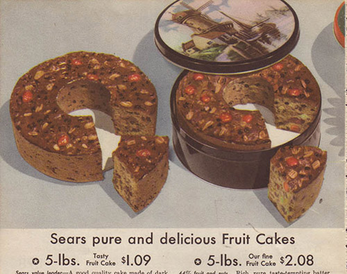
Tis the season for a new batch of classic department store Christmas catalog time travel! And today, I bring you that classic Christmas cliche, in all of it’s kitschy glory: The Christmas Fruitcake. These images are culled primarily from Sears Catalogs, from 1937 to 1988. The catalog fruitcake is a perennial favorite, though I don’t recall if I’ve ever once tried a slice. Given that it’s reputation precedes it due to negative reinforcement from movies, tv shows, comics and general vibes from other humans, I’ve always shurgged it off. Yet, there’s nothing about the ingredients of the standard fruitcake that really offends me. I like cake. I like candied fruit. I like nuts (within reason). I like Christmas. What is there for me to dislike? Maybe this year, I’ll give fruitcake a try. Until then, enjoy these colorful representations of that classic seasonal doorstop. Click any image to enlarge to the full page catalog ad.
Oh, and don’t forget to head over to Wishbookweb.com where I found these fantastic images. If you’re into 20th century advertising design, department store history or just enjoy looking at the Christmas catalogs from your childhood, this is an amazing website!
Read more
© 2012 – 2019 Jetpack Jason


