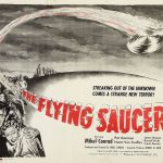
Before the digital revolution transformed visual media, game companies relied on hand-crafted, airbrushed illustrations to capture the imagination of players. Between 1977 and 1984, the golden age of arcade cabinets and early home consoles, video game marketing was a tactile, labor-intensive process. Artists used real paint, airbrushes, and physical cutouts to create the vibrant, larger-than-life advertisements that adorned flyers, cartridge boxes, and magazine spreads. This article explores the forgotten world of vintage airbrushed video game art, a craft that shaped how we first visualized digital worlds.
These weren’t just advertisements—they were dreams rendered in ink and pigment. With no Photoshop, no layers, no undo button, every stroke had to be precise. Mistakes meant starting over. The artists behind these works were unsung heroes of early gaming culture, blending sci-fi, fantasy, and pop art into compelling visuals that sold millions of cartridges. Today, their work stands as a testament to analog creativity in a digital age.
The Rise of Airbrush Art in Video Game Marketing (1977–1984)
The late 1970s marked the explosive growth of the video game industry. Atari’s release of Pong in 1972 laid the foundation, but it was the launch of the Atari 2600 in 1977 that truly ignited consumer interest. With limited graphical capabilities on screen, game publishers needed compelling visuals to convey the excitement of their products. This gap between simple on-screen graphics and the desire for immersive experiences created a demand for imaginative, high-impact artwork.
Enter the airbrush artist. Using tools like the Paasche VL airbrush, frisket film, and photostats, illustrators created dynamic scenes that suggested action, danger, and adventure far beyond what the game itself could display. These images often depicted muscular heroes, alien landscapes, and futuristic vehicles—none of which appeared in the actual game. Yet, they were effective. A child seeing a flyer for Space Invaders didn’t just see a row of blocky aliens; they saw a war raging across the cosmos, with Earth on the brink.
Arcade flyers were especially reliant on this art. Placed above or beside cabinets in dimly lit arcades, these full-color posters needed to grab attention instantly. The bold colors, dramatic lighting, and exaggerated proportions achieved through airbrushing made the games look epic, cinematic, and worth a quarter. Companies like Atari, Namco, and Taito invested heavily in their art departments, hiring skilled illustrators to produce consistent, high-quality promotional material.
Cartridge boxes followed a similar approach. With no digital thumbnails or online previews, the box art was the primary sales tool. Artists like Cliff Spohn, who worked at Atari, became instrumental in defining the visual identity of early video games. His airbrushed covers for titles such as Yars’ Revenge and Adventure are now iconic, celebrated not just for their aesthetic but for their role in shaping consumer perception.
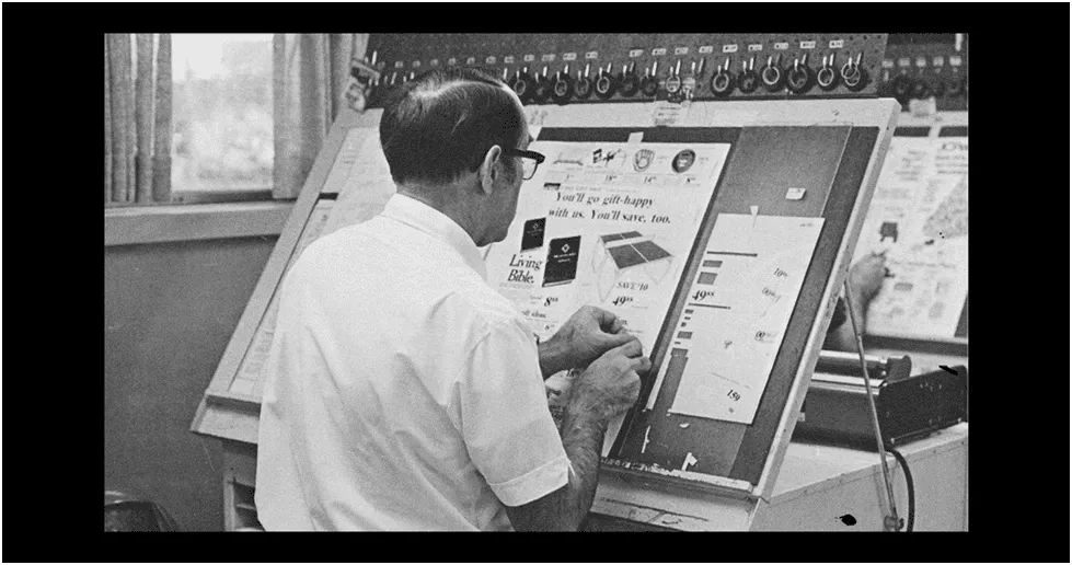
The production timeline was intense. A typical ad campaign began with a concept meeting between marketing and art directors. From there, a rough sketch was approved, then enlarged into a photostat. The illustrator would then spend several days airbrushing layers of color, using frisket to mask off areas like skies, characters, or explosions. Once complete, the artwork was photographed for color separation and sent to the printer. The entire process, from idea to printed flyer, could take as little as a week—remarkable by today’s standards.
What made this era unique was the total disconnect between the game and the art. Pitfall!, for example, featured a simple jungle explorer jumping over logs and scorpions. But the box art showed Pitfall Harry mid-leap over a crocodile in a lush, sun-drenched jungle—more Indiana Jones than 8-bit sprite. This wasn’t deception; it was storytelling. The art sold a fantasy, and in the absence of gameplay videos or online demos, that fantasy was everything.
As home computing grew in the early 1980s, so did the demand for consistent branding. Companies began building in-house art teams and style guides. Atari’s design language, for instance, favored bold primary colors, geometric shapes, and a sense of motion—even when the game was static. This visual consistency helped players recognize Atari products instantly, even from across a crowded store.
Voices from the Past: An Interview with a Former Atari Illustrator
To better understand the creative process behind these artworks, we reached out to a retired illustrator who worked at Atari during the early 1980s. Though he prefers to remain anonymous, his insights shed light on the daily realities of pre-digital game art production.
“We didn’t have screens or tablets. Everything was done by hand. You’d get a spec sheet from marketing—sometimes just a sentence describing the game—and you had to turn that into a full-color scene. I remember working on Galaxian—the actual game had tiny pixel ships, but the flyer showed a massive mothership descending with laser fire. That’s what sold it. We weren’t illustrating the game; we were selling the fantasy.”
He described the studio environment as fast-paced and demanding. Deadlines were tight, revisions were common, and there was little room for error. “If you smudged a line or over-sprayed, you’d have to cut out that section and patch in a new piece of illustration board. There was no ‘Ctrl+Z.’ You learned to be precise, or you didn’t last long.”
The artist also emphasized the collaborative nature of the work. “We worked with photographers, layout artists, and copywriters. Sometimes we’d shoot reference photos of models in costumes, then airbrush them into alien worlds. Other times, we’d paint over photostats—enlarged prints of concept sketches—to build up layers of color and texture.”
When asked about the transition to digital tools, he noted, “By the late 80s, we saw the writing on the wall. Computers were faster, cheaper, and more forgiving. But something was lost. The warmth, the texture, the human touch—it’s hard to replicate that with a mouse.”
He recalled one particularly challenging project: the Asteroids flyer. “They wanted a sense of infinite space, with glowing asteroids and a ship that looked like it could survive a thousand battles. I used translucent layers of blue and violet, built up over days. The final print didn’t capture half of it—but kids didn’t care. They saw adventure.”
His final reflection was poignant: “We weren’t famous. We didn’t sign our work. But I still get emails from people who say, ‘That Missile Command poster hung in my room for years.’ That’s the real legacy—not the paycheck, but the memory.”
Tools of the Trade: How Airbrush Art Was Made
Creating airbrushed game art required a specialized toolkit and a deep understanding of both painting and print reproduction. Below is a breakdown of the essential tools used during this era.
Paasche VL Airbrush
The Paasche VL was the industry standard for professional illustrators. Known for its precision and durability, it allowed artists to apply thin layers of paint with exceptional control. Unlike cheaper models, the VL could handle both fine detail work and broad coverage, making it ideal for large-format game flyers. It required an external air compressor, which many studios kept humming in the background throughout the day. Cleaning the nozzle after each use was critical—clogs ruined hours of work.
Frisket Film
Frisket is a removable masking film used to protect areas of an illustration from overspray. Artists would cut precise shapes out of the film and apply it over parts of the artwork they wanted to keep clean. This was crucial for creating sharp edges, glowing effects, or layered colors without blending. For example, when painting a spaceship against a starry background, frisket would mask the ship so the stars could be sprayed first without touching the hull. It was delicate work—peeling too fast could lift paint.
Photostats
Short for “photostatic print,” photostats were high-contrast, black-and-white reproductions of line drawings or rough sketches. Artists used them as underlays for final paintings. The sketch would be taped to a board, and a photostat would be placed on top—sometimes reversed or resized. Then, the artist would paint over it using transparent inks and airbrushed gouache or acrylics. This ensured accuracy and consistency across multiple pieces. Photostats were also used to scale artwork for different formats—flyer, box, manual, etc.
Illustration Board & Gouache Paint
Most final artworks were painted on heavyweight illustration board, which provided a smooth, stable surface. Gouache—a type of opaque watercolor—was the preferred medium because it dried quickly, could be layered, and scanned well for print reproduction. Artists mixed custom colors to match Pantone swatches, ensuring consistency across different print runs. Gouache could be reactivated with water, allowing for touch-ups, but too much moisture risked lifting previous layers.
Light Table & Burnishing Tools
A light table allowed artists to trace or refine sketches beneath translucent paper. Burnishing tools were used to smooth surfaces, correct minor imperfections, or polish metallic areas. These tools helped achieve the glossy, high-finish look expected in commercial advertising. Some artists even used dental tools for fine detailing on characters or vehicles.
The entire process, from concept to final art, could take anywhere from a few days to several weeks, depending on complexity. Each piece was a one-of-a-kind original, often discarded or lost after scanning for print—making surviving examples today extremely rare. Some were reused as studio decoration; others ended up in landfills when offices downsized.
Original Art vs. Printed Ad: A Side-by-Side Analysis
One of the most fascinating aspects of vintage game art is the difference between the original painting and the final printed advertisement. Due to the limitations of offset printing and color separation, the final product often diverged significantly from the artist’s intent.
Example 1: Asteroids Arcade Flyer
Original Art: The painting features deep cosmic blues, glowing asteroid surfaces, and a crisp vector-style ship with metallic sheen. The background stars are meticulously airbrushed with varying opacity for depth.
Printed Ad: The flyer, printed using CMYK process, loses much of the subtlety. Blues shift toward green, the ship appears flatter, and the stars are reduced to dot patterns. However, the bold composition still conveys urgency and scale.
Example 2: Pitfall! Cartridge Box
Original Art: The hero, Pitfall Harry, leaps over a crocodile with dynamic motion blur and sun-drenched jungle foliage. The airbrushing creates a sense of heat and humidity.
Printed Ad: The box, printed on glossy cardboard, compresses contrast and slightly muddies the greens. The motion blur is less pronounced, but the overall energy remains, and the vibrant orange of Harry’s shirt pops effectively.
Example 3: Centipede Cabinet Art
Original Art: A surreal, psychedelic forest with a giant centipede rendered in iridescent reds and purples. The background pulses with concentric color waves, suggesting danger.
Printed Ad: The cabinet’s wrap-around art simplifies gradients and reduces color depth due to screen printing limitations. Yet, the bold shapes and high contrast make it instantly recognizable and visually striking in an arcade setting.
Example 4: Missile Command Box Art
Original Art: A post-apocalyptic sky with layered explosions, missile trails, and a glowing city in the distance. The use of red-to-orange gradients creates a sense of heat and urgency.
Printed Ad: The box version loses some gradient smoothness and the city becomes a silhouette. However, the emotional impact—fear, tension, survival—is preserved through composition and color blocking.
These differences highlight the challenges of analog reproduction. While modern remasters often “correct” these prints to match the original art, purists argue that the printed versions are the true cultural artifacts—the ones seen by millions of players in their youth. The slight imperfections, the color shifts, the dot patterns—they’re part of the nostalgia.
Free Hi-Res Scan Pack: 8 Classic Airbrushed Game Ads
To celebrate and preserve this lost art form, we’re offering a free downloadable pack of high-resolution scans from original 1977–1984 game flyers and cartridge art. These images have been digitized from rare physical copies, cleaned of dust and scratches, and optimized for study or personal use.
The pack includes:
- Atari 2600 Combat Box Art – Early military-themed illustration with tank silhouettes and explosion effects.
- Space Invaders Arcade Flyer – Classic Japanese design with towering alien figures and laser barrages.
- Yars’ Revenge Cartridge Art – Cliff Spohn’s surreal, insectoid warrior in a neon battlefield.
- Adventure Manual Cover – Fantasy-inspired landscape with castles and dragons, rare for Atari at the time.
- Galaxian Cabinet Side Art – Dramatic red-and-black composition with a descending alien fleet.
- Pac-Man Flyer (Namco, 1980) – Vibrant, cartoonish style with Pac-Man chasing ghosts through a maze.
- Missile Command Box Art – Apocalyptic sky with incoming warheads and defensive explosions.
- Donkey Kong Arcade Poster – Early depiction of Jumpman (later Mario) scaling a construction site.
These scans are provided for educational and nostalgic purposes. They may be used in presentations, articles, or personal collections, but commercial redistribution is prohibited. To download, visit our archive page or subscribe to our newsletter for instant access.
Each scan comes with metadata: year, publisher, artist (if known), and printing technique. We encourage educators and historians to use these materials to teach about pre-digital design, advertising psychology, and the evolution of gaming culture.
The Legacy of Airbrushed Game Art
The era of airbrushed video game art may be over, but its influence endures. Modern game trailers and promotional materials still rely on the same principle: selling a fantasy. Today’s digital artists use 3D renders and AI-assisted tools, but the goal remains unchanged—to make the player believe in a world beyond the screen.
What set the airbrush era apart was its humanity. Each piece was touched by hand, shaped by breath and muscle, and limited by physical laws. There was risk, imperfection, and authenticity. In an age of infinite digital undo, there’s something deeply inspiring about art made without a safety net.
As retro gaming continues to grow in popularity, so does appreciation for these analog masterpieces. Museums have begun exhibiting original game art, collectors seek out vintage flyers, and designers study the techniques for inspiration. The airbrush may no longer be the tool of choice, but the spirit of those early illustrators—bold, imaginative, and unafraid to dream—lives on in every pixel.
Let this article serve as both a tribute and a resource. Whether you’re a designer, historian, or lifelong gamer, the story of pre-Photoshop game art is a reminder that creativity has always found a way—long before the digital age made it easy.
We honor not just the art, but the artists—the quiet creators who painted futures we could only imagine. Their brushes may be silent now, but their visions still glow in the memory of anyone who ever dropped a quarter into a cabinet and dreamed of saving the galaxy.